Using the New Outlook Mail
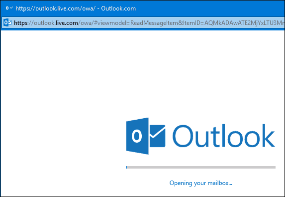
Is it worth it? For all the new functionality offered in the revamped service, there is still some kinks to work out. Search is one obvious area that needs more refinement. If you use Microsoft’s Outlook Web Mail service; offered as part of the company’s enterprise mail server, Exchange, you might notice how similar both OWA and Outlook Mail are. Well, that’s because both are based on the same platform, Office 365. In fact, when I logged in and launched the Outlook.com Favicon on my taskbar, I thought I was loading Office 365 and mistakenly closed the window. The sign in experience works the same, but it’s strange seeing this, too since the previous Outlook.com experience, never showed a splash screen before. It also appears when you pop out a message into a separate window. There is a lot to like, though, not just because it’s modern, but provides a more seamless, integrated experience with the rest of Microsoft services such as OneDrive and Windows 10. Outlook Mail as its now called also offers richer editing tools; making the composition of emails more enjoyable and easier.
When you load Outlook Mail for the first time, the service looks strikingly familiar. The header features the app hub and access to services such as Skype, Notifications, Settings, and Help Center. The Outlook Mail interface eschews legacy Windows 8 embellishments, featuring a flatter appearance, almost similar to Office XP. It’s a little off at first, but eventually, you get used to it.
Inbox
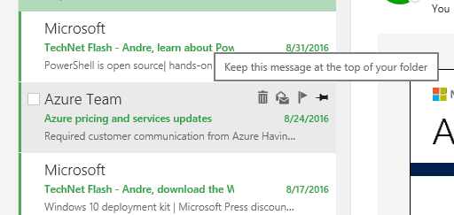
The first area of Outlook.com you normally interact with is the inbox. Similar to Outlook 2016, your new/unread mail are identified by a colored bar. Alongside flagged, delete and mark as read or unread is a new pin icon; which you can click to keep important messages at the top of your inbox.
Flagged messages seem to use up more space in your inbox than before, requiring scrolling down to see your new mail. A collapsible menu could resolve this. Mail messages are pretty much the same, but you will notice some small differences such as the Actions menu now called Reply. Just like Outlook Web Mail, Outlook Mail includes support for Add-Ins. The service comes built in with a few such as Evernote, more on that later. Hovering over a contact icon pops up a floating card with details; you can add as a contact, start a reply, schedule a meeting and even see the online status.
Composing Email
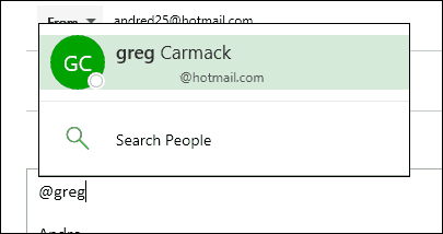
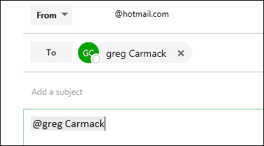
Outlook Mail features a split button for creating a new message or calendar event. The email form features larger fields and more powerful editing tools. Entering an address is the first sign of trouble, though, contacts I have previously communicated with, do not show up. Something I expected it to do considering I have talked with specific contacts numerous times. Outlook Mail includes some modern social networking capabilities; at mentions is one example. Instead of using the classic email address, you can just type @Andre, and Outlook will pop up a dialog with suggested contacts. This can be done with the recipient fields or within the body of the message.
I noticed when I copied text from a Word document, and all formatting was kept. Previously, this never happened; requiring I manually reapply paragraphing and indentation. Text selection pops up a convenient mini editing toolbar, similar to the Microsoft Word mini ribbon. Users who still prefer using plain text can switch to that option on the fly from the formatting bar at the bottom.
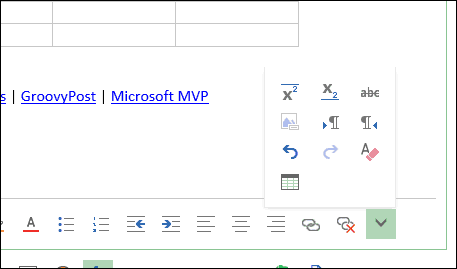
Some of the editing tools such as cursor alignment doesn’t seem to work yet. Additional formatting tools now include inserting a table, subscript, and strike through.
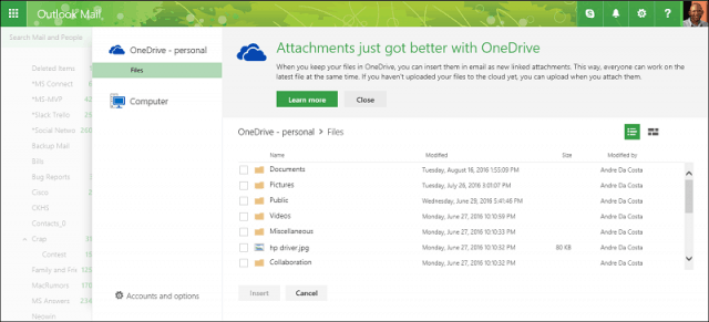
Inserting graphics and attachments into your messages are also faster and easier. A new backstage interface defaults to your OneDrive account, featuring a simple, easy to navigate interface. Too bad selecting local PC still launches a separate file dialog; integrating this into the main Files backstage would be more cohesive. You can also link other online storage services such as Dropbox and BOX.
Universal Search
Search is conveniently more accessible; providing an integrated experience without the need to launch a separate interface. Searching for mail and people is performed across all your folders, along with quick filters to help you find messages either to or from a recipient. Additional filters are available for attachments and date. A search next field can also help you quickly fly through a batch of results for a particular term. Not that different from previous releases, but much faster and real time. There is a strange awkwardness to how search works, if I enter a query, then decide to perform another query, I must first exit search then start again. I can’t just go back to the search field and start a new search query.
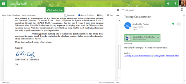
Collaboration is a big part of the new Outlook, and we previously covered some of the new document collaboration functions in Word 2016. Outlook Mail builds on this through its OneDrive integration. When you attach a Word document using OneDrive; this enables real-time collaboration from within your inbox. You can make a quick edit to update a document and resume sending it to a recipient. Definitely, a convenient way to work on documents in teams.
Add-In Support
I mentioned earlier an Evernote icon in the message header. Outlook Mail now supports add-in’s, similar to desktop Office applications. You can choose from a collection of add-ins that can enhance the messaging experience. From within the new Settings interface, you can manage your installed add-ins. Outlook Mail comes with several installed already, which include Bing Maps, Evernote, My Templates, Suggested Meetings and Unsubscribe. Add-ins can be easily installed by clicking the plus button then choose from one of the available sources such as the Office Store, URL or a file.
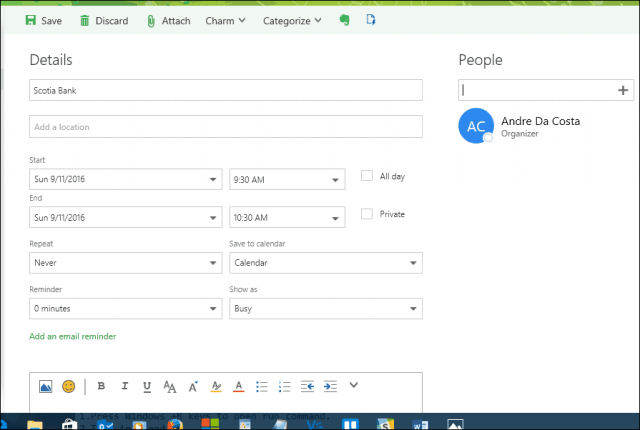
Along with the benefits of being built on Office 365, Outlook Mail also includes robust calendaring. The convenience of quickly adding a calendar event without leaving my inbox is a welcome improvement. You can also add people to your event on the fly using the search function.
Conclusion
I want to start wrapping this up, but there is so much to cover. In future articles, we will take a closer look at how to use many of the new features and additions to the service. Outlook Mail still needs to be refined in certain areas such as search, performance, and functionality. I don’t like that I have to exit the search UI to perform a new query. The display of a splash screen when loading your inbox is disconcerting in some respecting coming from the older Outlook.com. Messages in the inbox area too big, my flagged messages dominate most of it and I have to scroll down to start seeing new messages. The new attachments backstage is a nice update, it’s refreshing, but falls off when I want to attach a file from local disk. Couldn’t you let access to Explorer be embedded in the new backstage UI? What particularly makes the new Outlook great is its extensibility. We only covered a small aspect of add-ins, but so far, there are key ones in there, from Microsoft’s own Wunderlist, to heavy industry players such as Starbucks and Uber. This will certainly make using Outlook Mail a great experience. Overall, it’s a welcome update that feels more like a desktop app built for the web. Please advise. But, of course, you can pop for outlook 2016 if you prefer Ad free.. What do I have to do to get to my outlook email?? Been advised to delete all the old rules and start again. Bit of a pain. Best I suppose I need to approach it like something brand new. but, like why? when there was nothing wrong with it before. I sound like a cranky old man. gee.. I just might be one. Comment Name * Email *
Δ Save my name and email and send me emails as new comments are made to this post.
![]()

